NLP (Post one).
To start this project I want to look at endangered animals. I want to create a piece that belongs in society, and reminds people of the devastation.
For a piece with such heartfelt problems I need to research a few galleries, or even hotels that would be sensitive towards the subject. If these places can't accommodate I will have to look into making my own gallery space, whether that means renting a shop front or even virtually creating a gallery. This would be a great time to start an artist page on social media platforms, to create my own advertisement.
As for success, I feel like as long as I start getting the courage to show my work, even if it only reaches a few people I will be a success. I have issues's with self confidence and have never been a person to show my work to friends and family never mind post it all over social media. I hope to change that within this year.
My live project (Post 2).
For this project, I was thinking I could showcase my work, either by, Trying to make my own virtual gallery space and promote this on my social media platforms, or I would ask the council for permission to set up an installation in a nearby park. That way I wouldn't be risking anyone's health asking them to come to a small room with a few other people. The park is a nice open area that is accessible to literally anyone that walks by. The virtual gallery would not reach as many people but it would be seen by the people that are interested in my work or theme of work.
Visualisation (Post 3).
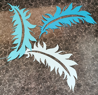
For my project I have been making a hanging installation, so I have been thinking the nearby park would be an easy way to do that, as I could hang my pieces on a tree, this would also be a fitting place for my work. As I have started creating paper cut outs of feathers that symbolise the feathers of the endangered bird, Hyacinth Macaw, I feel like if I were to hang these on a tree they would get a lot of attention from passers by, and be an easy point to get across, to viewers. I could also hang informative leaflets, or tape one to the tree trunk so anyone interested could read it. The images below are what I have been working on, and this is how they would look hung, I know it's not on a tree but you can visualise a lot more hanging around a tree. If needed to, with it being an outdoor atmosphere, paper might not hold well when it comes to the natural elements, so I could potentially make some out of resin, even plastic with my 3D pen. This could even be a mixed media piece. I have also thought of the idea that I could make these look damaged and hurt, by painting blood, burning and ripping them so they are clearly shown as endangered, but I'm not sure if the council would accept that with it being in the view of children, it might not be appropriate or even needed to give the desired effect. (the middle image is the location I wish to use for my art piece).


My own work (post 4).
This week as promised I tried out a new medium, resin! It is a hard medium to get the hang off so I started off small. I created some little blue feathers that I could so also possibly hang, like the first post. I started by mixing the solutions together and adding colouring and then transferred it to a mould, let it set which took its time. If I was to use this more often I would have to plan my time better, for this to work. I really like how the light hits these resin feathers, this would make a nice outside piece. I feel like this would be a very controversial, with how harmful this material is, but I think that works well in this context as we need to learn to stop being harmful to our environment.


My own work (post 5).
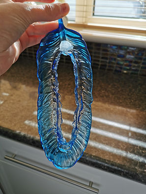
This week I thought I would try and make a bigger resin feather, for this all this didn't turn out like I had hoped, but I do like how delicate and broken it looks and gives it more of a feel of the endangerment these animals face. It would take even longer to create bigger ones and I don't think I would be able to balance all this and wait for these to set, I only have one mould for this and I would only be able to make at most 2 a week, which isn't ideal for a hanging installation.
Post 6.


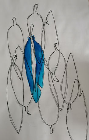
This week I decided that I would do some drawings, so I began using my installation idea as inspiration for these drawings. They are created with different thickness fine liners and water colour. I like the more abstract look it has to it, and I feel like only using colour for one feather makes the fact these birds are dying out more apparent, as the others are colourless and lifeless.
Post 7 Michael Murphy.
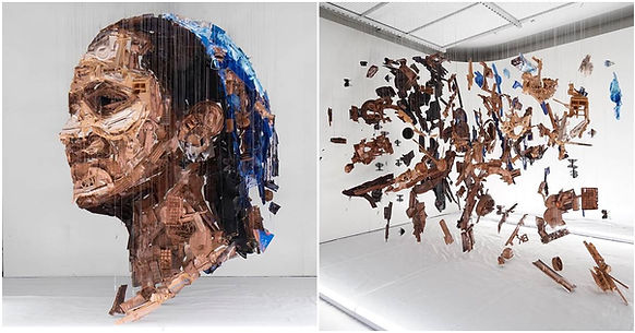
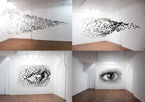
I have decided to look at artists that use the method of hanging to create their art. the first artist I looked at was Michael Murphy.
He works with a variety of mediums ranging from nails to high-tension wire, pastels, and even cardboard. Several pieces use directional light and shadows to create his images. These works change form depending on the line of sight, making his pieces interactive for viewers. This is the sort of art that boggles me, I just don't have the vision to create a piece like this, I wish I did I would love to try and use his method of measuring the objects to fit perfectly to create a piece. When making these you have to visualise your art layer by layer.

Post 8 Claire Morgan.
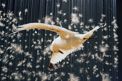
The next artist I researched was Claire Morgan. She uses hanging as a form of art but also adds taxidermy, this is what makes her work stand out to me, I obviously can't use taxidermy, as the birds I am using for the body of my work can only be found in south America, I just feel as though it would make my work more interesting and eye catching to my viewers. So if I were to do some blue sky thinking taxidermy would be high on my list to add to my final piece. Early on in Morgan's work she used just parts of the animal, such as feathers and unpreserved dead things, then her worked developed. My work could head in the same direction.


Post 9.

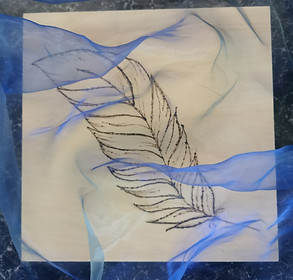
To keep with the feather theme, I created my first ever Pyrography piece. I thought this medium connected well as the wood was burning just like their habitats. I thought about the colour of their feathers and really like the fabric development as it seems like it has added movement to the piece. I didn't think the painted feather development worked as well as I hoped, it would, that piece seems to be lacking in action and I am not proud of it.

Post 10.
For my hypothetical live outcome, I have been able to hang my feathers on at least 5 trees around the park, with 50 feathers on each tree so I have created on average 250 feathers, of different sizes and mediums, mostly coloured paper some being made from resin, which makes a loud statement. As most of them are coloured paper they won't last long in the winter elements, making it all that more exclusive to an everyday passer by as they will be able to see the change of my feathers as they turn to mush (if it rains or snows). I would want to go and document the change myself, by taking pictures daily and videos of them swaying in the cold breeze, creating a movement like flying, which would further impact my endangered bird theme, depending on the harshness of the wind.
Post 11.
All in all I believe this project would work well as a public art piece, hanging from trees to cover a well used park. I think the subject is something that would benefit being displayed, as the theme is well known but not well covered, by this I mean there isn't many everyday actives that would make you aware of the on going issue around the world. I hopefully would like to be a small help towards this problem. My biggest hope would be if somebody was to view my artwork and then set out to contribute to a charity that is designed to help this endangered animals.
I think all my ideas line up well, and creates a acknowledgment to the environmental issues this world is facing, as all the aspect's of my work connect, I do feel like I could broaden my intended statement, so I am not only focused on one type of endangered species, this could mean I have more to work with artistically but also could go in depth with the environmental feature. I am excited to try more things regarding this in the upcoming weeks.
Semester 2.
Post 12.
For this semester I wish to create pieces using abstract techniques to show colours of endangered wildlife. I am using the same animal as last semester to get the idea of how to show colour the best through different abstract techniques. I would like to use the techniques I have played around with on the first semester, using the ones I think best show the colour of my chosen animal Hyacinth Macaw. I think 10 techniques should be enough to give you the lasting impression I hope for when talking about the endangered species, I wish to depict. I have thought of using many different mediums within this semester, including paint, hand emboirdery and even digital work
I believe with all the current lockdown rules it would be best if I created my own online gallery setup or join an already existing one. This will help me gain an audience for my art work. I will research any open online galleries and I might even put my work forward for a few, I think doing this will help my confidence. For this module I will also give evidence of me doing this by taking screenshots, and adding them to my blog. Or I could open my home to a small group of family and friends and set my house up as a gallery itself, hanging my pieces of work on my walls throughout my house, this will also help prepare me for times of offical gallery display, which is also a skill I have been lacking in, either way I will be gaining something, that will help me in the future.
I think my art for this semester will be hard to piece together as an endangered animal, as there will be no figurative aspects within my work, but the symbolisms of that shows if we don't act now to save these animals we wont be able to see them anyway, just like my art.
For me to have a succesful show I believe the main thing is to have my work seen by others, and not just myself. This is my only goal for a successful show.
Post 13.
This was a 25cm x 25cm wooden plate, I first used paint pouring technique to achieve my main effect of the colours of my chosen bird. I was then playing around with a palette knife and started to like this whispy look. I think the final outcome worked out well bringing out the colours I had hoped. I feel like these effects show what might be left of these birds if they do not get the proper care they need. I also believe it makes it look soft and fragile much like the feathers of these birds.
.jpg)


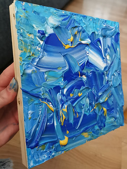
More palette knife work, I wanted to create texture with this piece, I believe I achieved that. Yet I feel this piece looks unfinished with the sides not painted. If I were to hang this for my gallery show I would have to go back and paint the sides of the canvas to make it look professional.


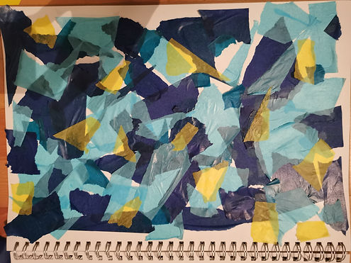
Here I wanted to use a collaging technique, to show the colours of the beautiful bird. I used coloured paper for the one on the left, and the one on the right is tissue paper. I like the torn effect of the normal paper, it give the effect of being hurt or damaged, just like the bird but the colours don't stand out as much as the tissue paper one and that is the main focus we are trying to capture. With the tissue paper piece I like the translucentness of the colours overlapping, creating new colours. These are on A3 pieces of paper.

These pieces are just experiments to see the best use of colour. One being blobs of paint that then dried like that with a smooth texture and the other being soft pastels on a black backgroud, which made the colours pop more. Yet I feel if I was to use soft pastels to create a piece I would have to use figrative aspects to get the full effect of the soft pastels.

Post 14.


Marbling. I used this technique to try and create a flowing image using only colour. I think they worked well but some of the ones on coloured paper washes out the colour of the paint. If I were to use this in a gallery setting I would need to flatten and frame these as they look scrapy otherwise. These are all created on A4 pieces of paper.


These paintings work really well as a flowing piece, working only with colour. These paint pouring pieces were created on a 60cm x 80cm canvas, and acryilc paint. I think these pieces are dyinamic and full of movement, I think this works with symbolising a bird that should be free, yet gets hunted and trapped.
Artists. (Post 15)
I have decided to look into abstract artists, that I feel a connection to, and or like how they create their artworks.
Wassily Kandinsky
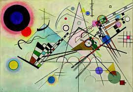
The first artist I have researched is Kandinsky, this man has influenced some major art movements such as, Dada, Bauhaus. The way he uses shapes and colour to create his art is so eye catching, I feel as if the colours compel me, I hope to be able to mimic this feeling when people look at my art. Kandinsky had a belief that abstract colours and forms could be used to express the “inner life” of the artist. He certainly tried to emphise this notion when it came to his art, making him one the the pioneers of abstract modern art. The well known style of Kandinsky came to him at first from listening to music, the man said that he could visualise sound as a non-objective form of art, he then strove to create art with an objectless manor, giving his viewers a entirly new senstation when looking at art.
Sers, P. (2016). Kandinsky: The Elements of Art. United Kingdom: Thames & Hudson.
_jfif.jpg)
Lyubov Popova

Popova had a style that overlapped many different movements, such as Cubo Futurism, Suprematism and the Russian Avant Garde. As a women artist she had her own difficulties, but thought the elitist ideas of "natural talent" would never hinder her artistic abilites, knowing that makes me, as an artist want to be more outgoing, makes me inspired to step out of my comfort zone and try and create my own confidence, much like Popova did. This women has been a big inspiration for my art and head space this semester.
Yablonskaya, N., Iablonskaia, M., Âblonskaâ, M. N., I︠A︡blonskai︠a︡, M. (1990). Women Artists of Russia's New Age, 1900-1935. United Kingdom: Random House Incorporated.

Jackson Pollock
The type of paintings Jackson Pollock was most famous for had to be his action paintings, this type of painting had been due to trying to treat his alcoholism. Action painting helped pollock understand his mind a bit more, making painting his escape. I have always wanted to try creating such a messy piece of work yet have it mean so much more than just paint on a board. I think I will use this time to mimic Jacksons style. Most of his work was made up of muted or primal colours, my art work is made up of the colours of my chosen bird, which I think will make it stand out and have that meaning I am looking for, giving it a strong connection to Pollock.
Varnedoe, K., Pollock, J. (1999). Jackson Pollock: Interviews, Articles, and Reviews. United Kingdom: Museum of Modern Art.


Joan Mitchell
Joan Mitchell is known for the bold colour and a sweeping brushstorke motion of her large scale and sometimes multi-paneled paintings. she had mentioned she gathered her inspiration from landscape, and nature, her overall intent was never to create a recognisable image but to make emotions her main focus. I think her style of work would be an amazing way to express the danger the Hyacinth Macaw faces everyday, the colours of the bird being spread across a massive canvas, slowly fading away with each brushstroke. It fits into my work so well, I will have to recreate this style, to make and share the story of these endangered creatures.
Lee, Y. Y., Mitchell, J., Nochlin, L., Livingston, J. (2002). The paintings of Joan Mitchell. United Kingdom: Whitney Museum of American Art.

_(.jpg)
Bridget Riley
I have chosen Bridget Riley not because her art is similar to what I create but because I love how her art work seems to move, if I could make a painting seem to move, it would really help bring an animal like feature to my art, making it easier for the viewers to piece together the meaning behind my paintings. Riley's art belongs to a few movements such as Op Art, Hard-edge painting and Modern art and she has been a major inspiration to many people all over the world, because she creates such dynamic images that it gives you a sensation no one else dared to achieve. This is an amazing technique.
Riley, B., Bracewell, M. (2009). Bridget Riley: Flashback. United Kingdom: Hayward Publishing.


Digital Art. (Post 16)
For my digital art I used organic flowing and freeing lines to represent the bird, (A bird is meant to be free, but this bird gets hunted and sold to be caged for the rest of its life.) I then manipulated my images to develop them in new ways.


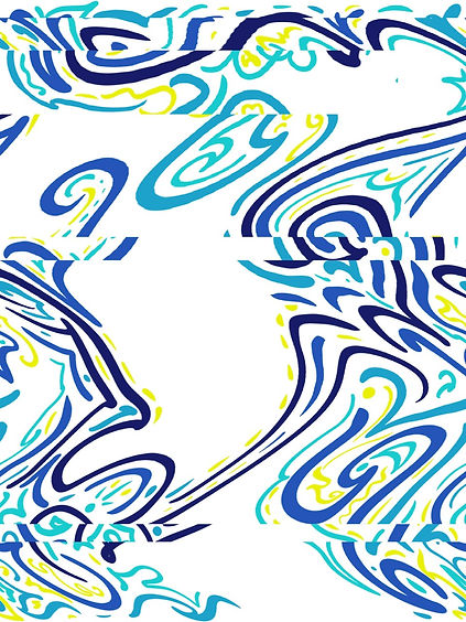

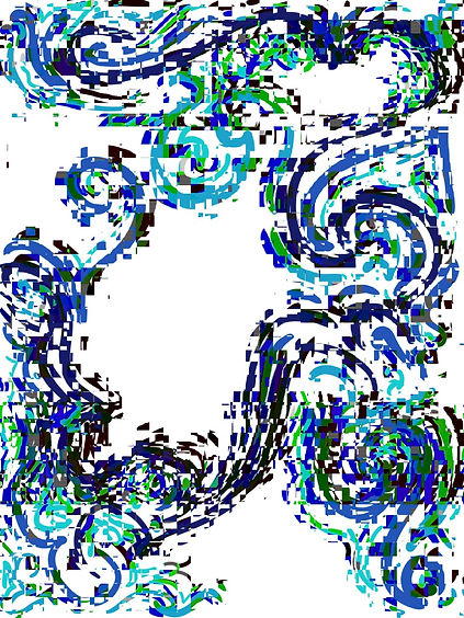
I like the distortion that came with the manipulation of my digital pieces, I feel like it gave a higher sort of urgency it fix the problem you can visible see, just like we should be doing to help these endagered birds. Following my digital art I moved on to a more tradional take, I hand embroidered, lino printed and foiled my prints.
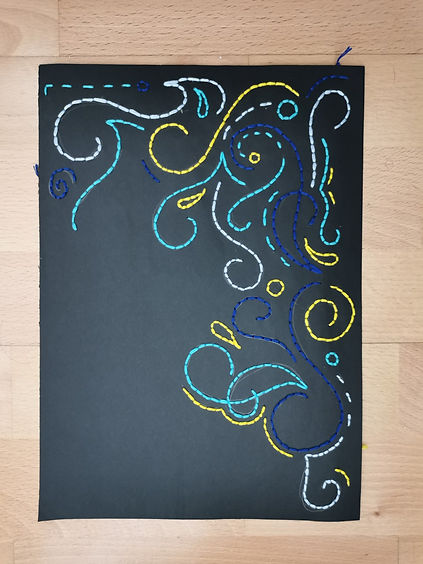
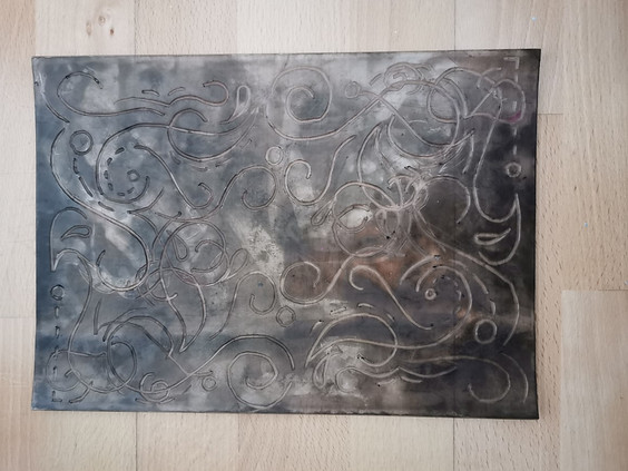


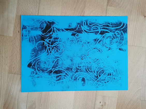
For these lino prints I really liked the distressed look, it gave the piece more charater, symbolising how distressed the hyacthin mawac would be.
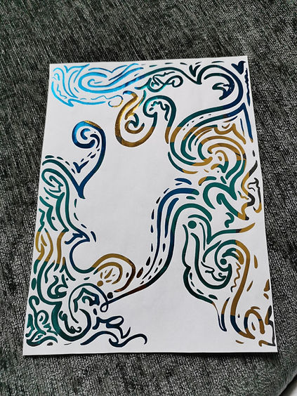


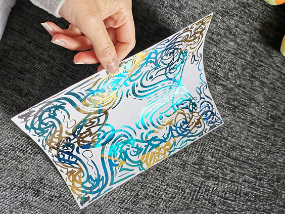
To foil my prints I had to print out my design using a laser jet printer, I then cut up my foil and placed them where I wanted each colour, you then have to put it through a laminator to heat the ink and stick the foil, you then peel away the remaining unused foil and you are left with a shiny print. I really like using this method but it is very hard to achieve a perfect effect.

I also used the Action method of painting like Jackson Pollock I really like the movement in this piece. The colours also stand out and dont seem to blend which makes it more eyecatching, and resemble the bird better. This is a 100cm x 30cm canvas
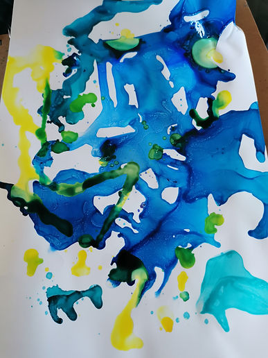
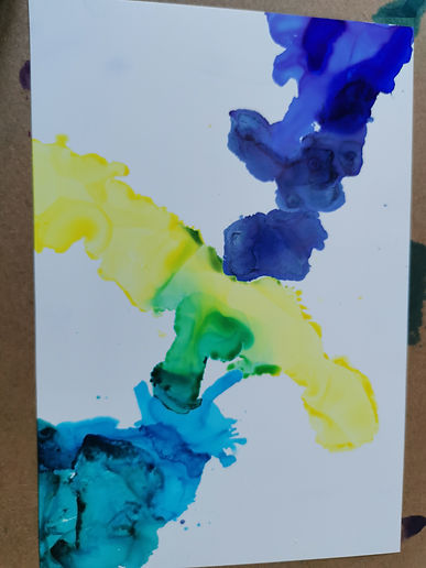
I began trying a new technique. I tried using alcohol inks, I'd never used them before and I thought they achieved a flowy organic look, just what I'm looking for, the colours are vibrant and work well for what I am trying to achieve but they are extremly messy to work with and hard to control. I would like to use them again but on a smaller size.
These are A4 size.

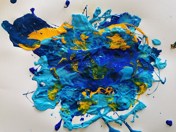
More fluid style paintings, I like the wispy soft look the first one gave but once adding more colours they started to blend and ripple which was also a nice affect. Then the last piece was squished together, but the ripples in the thick paint made it look like a birds feather, I loved the texture it gave off. It really pulls the piece together.



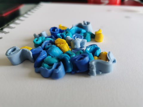
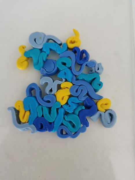
Working with polymer clay I thought the process of slowly merging into nothing would help viewers realise the reality of harm that these birds go through.
I liked working with the clay but it was my first try and didnt know the techniques to manuiplate it to the best of its abiltes, I think the colours were varied working in my favour, especially for the last image, but if I were to use this again I would have to look up ways on how to work with it better.
Final outcome concept. (Post 17)
I have decided for my final outcome I will use my own house, I feel as if I have more controll over my art that way. I will invite a small group of family to come visit my private viewing, I will create personalised invitations for my private gallery showing as well, to make it come across as a professional affair. I had tried using digital and virtual gallery layouts/ settings but I found that my photos and digital art were not coming out as clear as I'd like, I felt like it was unprofessional and did not showcase my talents to the best of my abilities.

.jpg)
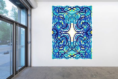
These are some idea concepts of how I would like to layout my art work with my house. I think the plain walls give it a gallery touch but I also think the beam gives it a touch of home and familiarity, which I like to portray within my art.
.jpg)
.jpg)
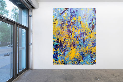
These are just some of the screengrabs of my virtual gallery layout, I think when using a digital medium to showcase your work, you can't necessarily convey scale very well, and that was a big downside for me as many of my canvas' are 100cm and above.
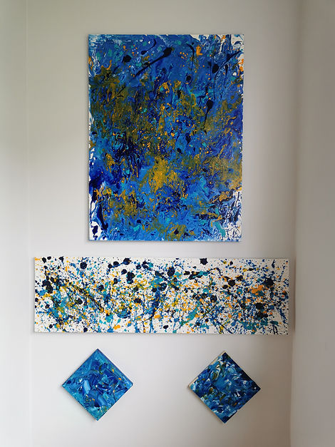
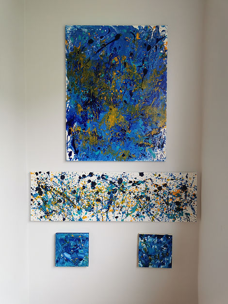
Here I began praticing with placement and arrangements. I like the square canvas' tilted, but the other looks more uniform.
Shaun space Crit (Post 18)
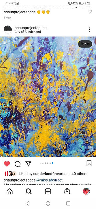
For my shaun space crit I was unable to come into universty, so I created a powerpoint with pictures of some of my newer works, that was projected onto the wall, and screen shared for the other students to be able to view it clearer. Yet most of, if not all the images I used within the powerpoint were used for the instagram takeover. @shaunprojectspace. Within the group crit I had people give me new ideas on how I could explain my work to viewers to make it simpler, which was helpful.
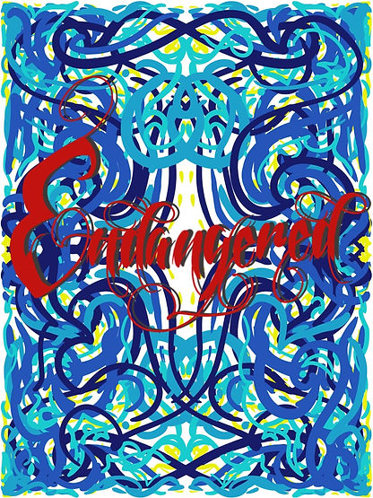
Trying to make my work easier to understand from a viewers point of view, I worked on my older pieces and began using calligraphy digitally to show my pieces highlight a bird that are infact endangered. Using my own font, which I believe works to show the caotic beauty of the subject I began editing my pieces, yet after seeing them as such I thought it came across too cluttered, and took the focus away from the actual piece I worked hard on, so I gave it a try and didnt like the outcome. But I am thankful for my classmates criticism.

Creative Lives Talk (Post 19).
Rosalind Faram
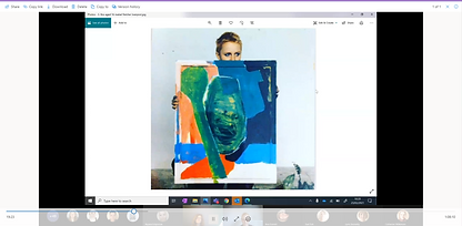
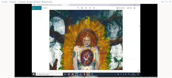
When listening to Faram's talk, she spoke about having as many styles as she could, showing symbolism, and meaning to her throughout her work, which I found very inspiring, and connected to my work well, as I have chosen to change up my style a lot this year and can be seen through my development. Rosalind had her own steep development using a bunch of different mediums and expirimenting with a lot of works. I like the fact she took chances, didnt go with the flow, this really caught my eye when listening to her talk. The images she showed us I felt the deepest connection with these 3 paintings. I really liked the simplist of each of these pieces.

Poster (Post 20)
As I am only holding a small gallery viewing in my house, instead of a poster, I made more of an invitation for my family, telling them place, time, day and cause. I am pretty happy with it, it fits the theme of my work well and the information doesn't get over powered by any of the pictures used. The main thing I think is important with these types of things is that it is clear and not distracting from the key terms.
.jpg)
Live Outcome (Post 21)
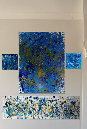
My final outcome, I am happy with the placement of each of my pieces of work, and only included the best of the piece's, although I had no printer to print out my digital, I think the foiled images made up for what was left out. I had a few family members around to see my artwork and they all thought it was very eye catching, I am pleased with the outcome. I do believe if I had a better camera it would have made my outcome look more professional, and better quality all round but I am happy I with what I achieved with the limited resources I had. I made a great day out of it.
.jpg)
